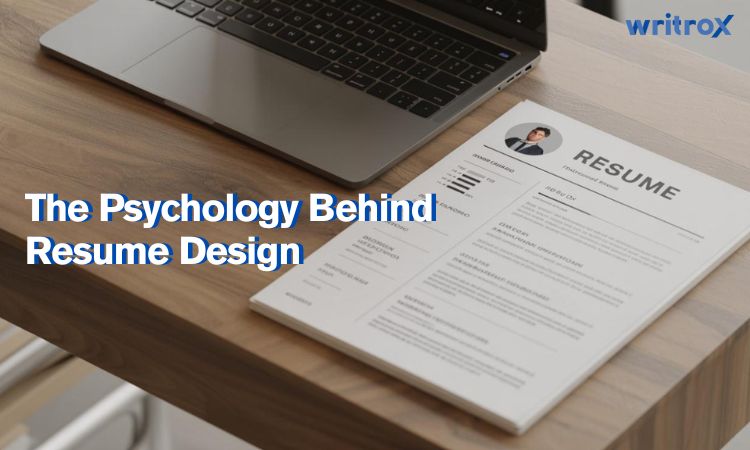
You must’ve taken a look at your resume sometime and wondered what kind of a first impression it would make on a recruiter, haven’t you? Let me start by telling you that recruiters have a keen eye about perceiving details and picking out fallacies. They may draw conclusions about your behaviour & approach based on the logic and effort you put into designing your resume.
They gain this skill through years of experience. Therefore candidates are expected to put their best foot forward, if they want to stand out among the crowd. They are even advised to take assistance from resume writing services. Remember, first impressions matter, especially in a competitive setting. But for that, you need to know the Resume Psychology and its uses.
So let’s discuss your resume building skills and learn more about a recruiter’s perspective.
Why Resume Design Matters?
1. First Impression Matters a Lot
Hiring managers typically take seconds to scan your resume. An uncluttered, nicely laid-out design immediately draws their eye and makes them want to read on, while resume mistakes can turn them off easily. That first impression may make or break your resume’s chances of advancing to the next round.
2. Easy to Read = Easy to Get
A well-thought-out resume with clear headings, bullet points, and sufficient white space makes it easy for recruiters to quickly identify important information. When your resume is easily readable, it’s more likely that recruiters will be able to read and understand your qualifications and suitability for the position.
3. Design Reflects Your Personality
Your resume design speaks for your professionalism, creativity, and attention to detail. A good layout indicates you care about quality and are familiar with industry norms, while an untidy or obsolescent layout can imply the reverse.
4. Hooks the Recruiter's Interest
You must design the resume layout to highlight some text with bold font or show a visual hierarchy to direct the recruiter’s gaze to the most significant areas, i.e., your skills and accomplishments, highlighting your strengths.
5. Supports ATS Compatibility
The proper resume format needs to balance aesthetics with technical needs. Most companies put their resumes through an ATS(Applicant Tracking Systems). Making your resume ATS-friendly will help its chances to reach human readers first.
By mastering resume design, you’re not just listing your experience but you’re strategically influencing how recruiters perceive you from the very first glance.
Let Your Resume Breathe: The Power of White Space

White space is the unused space between the text, sections, and design elements on your resume. This is also called negative space. White space creates the air for your content to breathe. Most people ignore it completely but resume psychology suggests it plays a crucial role in how your resume is perceived.
White space provides your resume a clean and professional look. Your resume will be easy to scan and look through your resume without the recruiter can look through your resume without losing in a wall of text.
White space also helps the reader’s eye to flow from section to section, creating emphasis to your content. It may increase comprehension by 20%. If your resume is full of text and has little white space, it may seem cluttered and hard to read. Too much white space may make it look too empty and incomplete.
How to Use White Space Effectively in Resume Format:
Balance and proportion: White space needs to be evenly distributed across your resume so that there are no cramped sections or empty sections.
Paragraph and line spacing: Provide a little more space between paragraphs, and increase the line space (1.0-1.15) for easier reading.
Margins and padding: Always add decent margins (about 1 inch) to frame your own text and prevent clutter on the page.
Section gap: Provide space between each section on your resume (like Experience, Education, Skills) to help the recruiter scan easily.
Bullet points/lists: Use bullet points and provide space between your bullet points both for clarity and for impact.
Fonts That Work: Pick the Right Style
Fonts Communicate Outlook. The font you choose for your resume is more than a design choice; it communicates an “outlook” of professionalism and personality. A nice, clean modern font suggests that you are organized and up-to-date, while an atypical or outdated font may suggest that you are less formal and potentially unprofessional.
Recruiters often subconsciously form impressions based on the font you use. Choosing a font that will give you a strong first impression is important. So when selecting a font, avoid decorative or difficult-to-read fonts. The resume psychology asks you to keep all your credentials in one paper, keep your font size consistent (10-12 points for body text) and font style in your resume ensures that your writing stands out, for all the right reasons.
For an ideal polished and readable resume design it is best to stay with classic, accepted fonts. Your best options are:
Calibri: modern, clean, and easy to read.
Arial: Professional, simplicity, and highly legible.
Helvetica: contemporary and sleek; great for a clean look.
Times New Roman: Conservative and formal; a good option for conservative industries.
Cambria: designed for reading digitally, a good option for digital resumes.
Smart Use of Color in Resumes:

Color can be an effective element in your resume design if used carefully. If you don’t want to use colours, it’s totally fine. But if you do, recruiters may attach meanings to colors- blue indicates trustworthiness and professionalism; green indicates growth and calm; and red can mean energy and creativity. Here are some tips.
- Remember that overdoing the color could also show a lack of professionalism as well. Too much of anything will distract the reader. The key is to be subtle.
- You can add color to section headings, lines, and your name. The idea is to add visual interest without being intrusive.
- One or two colors that complement each other is perfect. You may give the reader enough contrast to read easily.
- Avoid using bright or neon colors, but be sure to print your resume in color as well as black-and-white, because some recruiters may print your resume in black-and-white.
If used correctly, color can add uniqueness to your resume while still maintaining a polished and professional look.
Resume Layout That Makes Sense

An effective resume format will make sure that your information is easy to find and leaves a positive impression! Here is how you design a format that works:
1. Best Order for Sections:
You should have your name and contact information at the top (email, linkedin etc). It’s followed by a professional summary or objective, then work experience. Next is education, and then skills and/or any additional sections (like certifications or volunteer work). You should add a bar of your hobbies too that may be relevant to the impression you are trying to create.
2. Keep it Clean and Balanced:
Make sure to clearly separate sections with headings, use bullet points for lists, and keep even spaces on all sides of each heading. Do not jam too much information on one page, you can use white space to separate sections and let viewers process each section.
3. Logical Flow:
When listing information, use reverse chronological order within each section to show viewers your most recent and relevant experiences first.
4. Simple Navigation:
To help viewers navigate your resume, make the section titles bold or a slightly large font. Make sure to align text according to your margins.
When your resume is clean, balanced, and easy to follow, it makes it easy for recruiters to find the information they are looking for, and it makes your resume stand out for all the right reasons!
Conclusion:
Knowing the psychology of resume building, gives you an insight into creating that all-important first impression. Take time and select the right font and colour. Use your white spaces and indentations wisely to impress the recruiter and you’re all done.
Remember, your resume is the most important marketing tool for you. So you must aim to leave the best professional impression based on your personality while being honest and clear. With these strategies, you will improve your chances of standing out and securing that interview.
If at any point you feel unsure, seeking professional help can make a real difference. It’s worth reviewing available resume pricing options to understand what kind of support fits your needs and budget.


