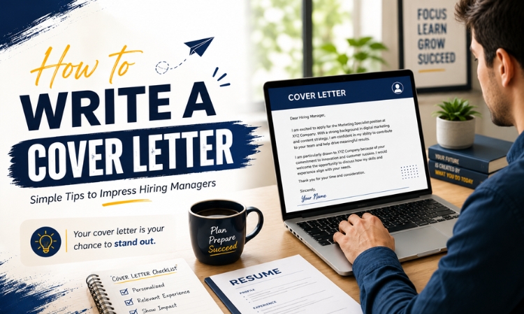
How can your resume ultimately land on the recruiter’s table? This would be the main goal as you begin your resume writing process.
Grabbing the full attention of the recruiter in a matter of only 10-20 seconds is a matter of presentation. Only a well- presented and impressive resume will be put forward in the process of selection. Nevertheless, the readability and professionalism not to be compromised
Here are few ways how you can design the best professional resume:
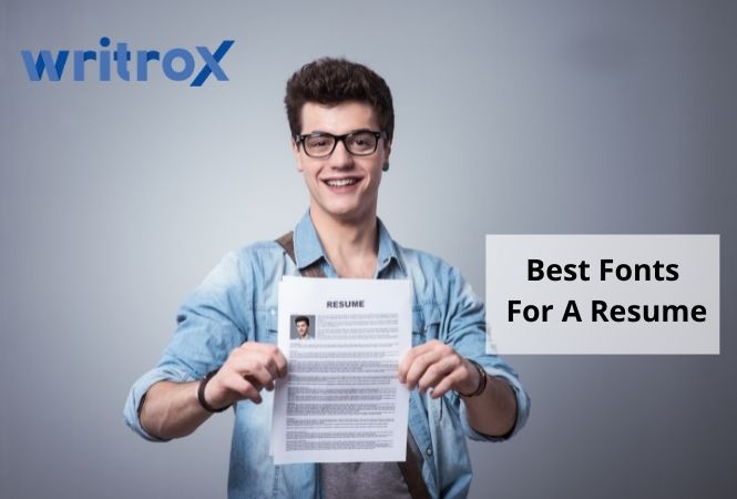
How Do You Choose the Best Fonts For A Resume ?
With so many options, you might feel a little overwhelmed to decide on which font gives the best impression to the recruiter.
You should also keep in mind that if it is difficult for the recruiter to read the resume, they might just put it off and reject it. Numerous software also assists in this case like the ATS system, also known as Applicant Tracking System. It helps to sort and record the job applications. These programs also interpret with the fonts to sort out the job applications. Those illegible or those which cannot be read turns them into black boxes or illegible characters.
As you know, different resumes require different kinds and levels of creativity. A graphic designer or other such creative fields require a creative resume that showcases the levels of creativity in the person. However, making sure that the resume is also not very overly done and readability is its top priority.
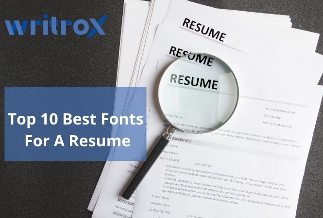
Top 10 Best Fonts For A Resume
Calibri:The modern and soft font, which is also the default font for many email programs. It is also the most familiar to the eye font.
- Times new roman: Most of the corporate, operations, and legal aspects accept this as the font. It is the most electronically readable font.
- Arial: Most preferred on the creative field aspects, also greatly preferred in the marketing field.
- Verdana: Greatly preferred for its modern touch and also good readability for its gentle wider spacing.
- Cambria: It is just another formal, default-type font that most recruiters are familiar with.
- Garamond: Gently inclined towards more on the artistic side, it is more suited for the artist peers.
- Book antique: It works well with the professionals that are more inclined towards subjects like arts and humanities.
- Trebuchet MS: The round and creative, modern font is most suited for the creatives and marketing fields.
- Arial narrow: This sans serif is the most modern and consumes less spacing, thereby also being legible.
- Didot: This stylish and readable format is artistic yet professional at the same time.
What Is the best font size for a resume?
The most preferred best font size for a resume is anywhere between 10 to 12. The resume font layout has a great impact on your layout and the overall resume. Since the resume has to be kept one page, therefore it is greatly preferred to keep it in the size 10. Also, you must avoid making your resume below the font size of 10. It might make it difficult to read a document for the recruiter.
Also, be very specific while writing the resume, as you have to make it under one page itself. Therefore, if it is two pages or longer then try to make it under one page by keeping it in 10 point format and removing all the unnecessary data and phrases. Only highlight the most relevant context in your resume and maintain the overall consistency.
What are the other things to consider while resume writing?
- Easy to read font: Always remember to use a clean and simple format to encourage the employers to look at it. Make use of clear words and avoid using complex fonts and sentences. Here, you can use sans serif fonts which are good for readability and also simple yet professional. It might include fonts like Times New Roman, Cambria, etc.
- Avoid light fonts: While writing a resume focus on readability. avoid overly designed formats, thin and light formats which might be difficult for the employer to read.
- Resume font style: Style up your resume by adding bold letters, underlining it, and italicizing it. You can add up the different fonts to highlight important sections like education and experiences etc.
Conclusion
Mentioned above are a few ways to style up and choose the best font for your resume.
To design the best readable and styled resume for yourself, you can contact Writrox, here, our professionals will help you do your best with the Resume Writing Services that you are putting forward for your dream job.